
섹션1
html
<section id="first_section">
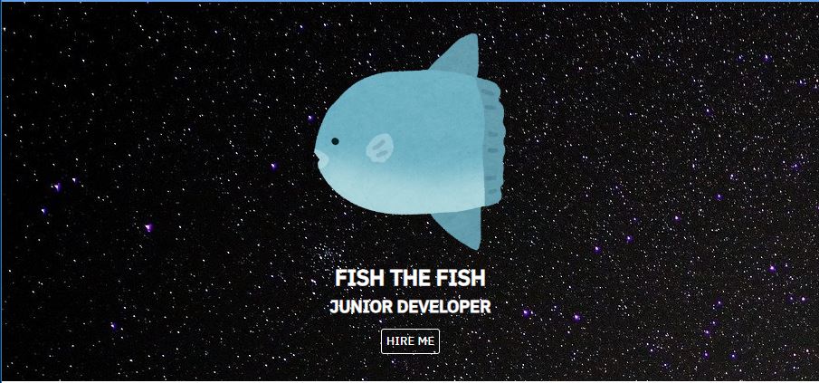
<img src="./img/fish_mola2.png" alt="">
<h1>FISH THE FISH</h1>
<h3>JUNIOR DEVELOPER</h3>
<button>HIRE ME</button>
</section>
css
/* first section 시작 */
#first_section{
    /* 부모 */
    /*세로 중앙정렬
    방법 1
    text-align: center; */
    /*방법 2
    display: flex;
    flex-direction: column; flex 방향을 90도 돌림(원래 row 방향>column 방향)
    align-items: center; 원래는 세로 정렬>가로 정렬이 됨
    justify-content: center; 원래는 가로 정렬>세로 정렬이 됨*/
    text-align: center;
    color: white;
    /* 자신 */
    background-image: url('./img/background.jpg');
    padding: 30px 0;
}
#first_section img{
    width: 250px;
    height: 250px;
    /* border: 1px solid white; */
    border-radius: 25%;
}
#fist_section h1{
    margin: 10px;
}
#fist_section h3{
    margin: 10px;
}
#first_section>button{
    /* 자신 */
    background-color: transparent;
    color: white;
    border: 1px solid white;
    cursor: pointer;
    padding: 3px 5px;
    border-radius: 3px;
    margin: 10px 0 0 0;
}
/* first section 끝 */
섹션2
html
        <section id="second_section">
            <h1>Service Offers</h1>
            <p>귀여운 개복치를 드리겠습니다</p>
            <div id="skill_box">
                <div class="skills">
                    <div class="skill_icon">
                        <i class="fas fa-water"></i>
                    </div>
                    <h4>Back-end</h4>
                    <p>설명글</p>
                </div>
                <div class="skills">
                    <div class="skill_icon">
                        <i class="fas fa-otter"></i>
                    </div>
                    <h4>Back-end</h4>
                    <p>설명글</p>
                </div>
                <div class="skills">
                    <div class="skill_icon">
                        <i class="fas fa-ship"></i>
                    </div>
                    <h4>Back-end</h4>
                    <p>설명글</p>
                </div>
            </div>
            <div></div>
        </section>
css
/*second section 시작*/
#second_section{
    /* 부모 설정 */
    text-align: center;
    /* 자신 설정 */
    padding: 10px;
}
#skill_box{
    /* 부모 설정 */
    display: flex;
    align-items: center;
    justify-content: space-evenly;
    /* 자식들이 width 33%로 나눠가지고 남은 공간을 균등하게 배분 */
    /* border: 1px solid red; */
    margin: 10px 0;
    /* 자신 설정 */
}
.skills{
    /* 부모 설정 */

    /* 자신 설정 */
    /* border: 1px solid green; */
}
.skill_icon{
    /* 부모 */
    font-size: 80px;
    line-height: 170px;
    /* i는 글자>글자는 세로 중앙정렬>(글자+행간)을 자신 높이만큼 설정 */
    text-align: center;
    /* 글자 가로 중앙정렬 */
    /* 자신 */
    width: 170px;
    height: 170px;
    border-radius: 50%;
    /* border: 1px solid red; */
    transition: all 0.5s;
    margin: 0 auto;
    /*형제요소가 지나치게 커져서 공백이 생겼을 때
     위아래는 0, 좌우는 자동>마진 2등분>중앙정렬(블록요소만 가능) */
}
.skill_icon:hover{
    color: cornflowerblue;
}
/* second section 끝 */

섹션3
html
        <section id="third_section">
            <h1>My work</h1>
            <p>Projects</p>
            <div class="category">
                <button>All<span>8</span></button>
                <button>Front-end<span>3</span></button>
                <button>Back-end<span>3</span></button>
                <button>Mobile<span>2</span></button>
            </div>
            <div id="project_box">
                <div class="boxes">
                    <a href="#">
                        <img src="/img/suisou_side.png" alt="">
                        <div class="text_box">
                            <h3>Youtube site</h3>
                            <h4>Clone coding</h4>
                        </div>
                    </a>
                </div>
                <div class="boxes">
                    <a href="#">
                        <img src="/img/초롱아귀.png" alt="">
                        <div class="text_box">
                            <h3>Youtube site</h3>
                            <h4>Clone coding</h4>
                        </div>
                    </a>
                </div>
                <div class="boxes">
                    <a href="#">
                        <img src="/img/suisou_side.png" alt="">
                        <div class="text_box">
                            <h3>Youtube site</h3>
                            <h4>Clone coding</h4>
                        </div>
                    </a>
                </div>
            </div>
        </section>
css
/* third section 시작 */
#third_section{
    /* 부모 */
    text-align: center;
    /* 자신 */
    padding: 10px;
}
#third_section>h1{
    margin: 20px;
}
#third_section>p{
    margin: 20px;
}
.category button{
    /* 부모 */

    /* 자신 */
    font-size: 24px;
    padding: 0 10px 0 30px;
    margin: 0 1px;
    background-color: white;
    border: 2px solid cornflowerblue;
    border-radius: 5px;
}
.category button span{
    /* 자신 */
    border-radius: 50%;
    background-color: cornflowerblue;
    font-size: 80%;
    color: white;
    /*정사각형>원으로 만들기 위해서 width와 height를 줘야 함 */
    display: inline-block;
    width: 27px;
    height: 27px;
    line-height: 27px; /* 세로 중앙정렬 */
    /* 이동 */
    position: relative;
    top: -20px;
    left: 10px;
    opacity: 0;/* 불투명도 */
    transition: all 400ms;
}
.category button:hover span{
    top: -10;
    opacity: 1;
}
#project_box{
    /* 부모 */
    display: flex;
    justify-content: space-evenly;
    align-items: center;
    flex-wrap: wrap;
    /* 자신 */
    padding: 10px;
}
.boxes{
    position: relative;
    width: 33%;
    height: 250px;
    margin: 0 0 5px 0;

    /* 인라인 요소인 a태그(및 그 자식인 img)가 넘침 */
}
.boxes a{
    display: block;
    text-decoration: none;
    color: black;
}
.boxes a img{
    /* 최대 넓이와 높이가 부모 사이즈를 넘지 못하게 조정 */
    max-width: 100%;
    max-height: 100%;
    padding: 25px 0 0 0;
}
.text_box{
    position: absolute;
    /* top: 50%;
    left: 50%; */
    /* 기준 relative의 x축 절반, y축 절반에서 왼쪽 위 시작 */
    /* transform: translate(-50%, -50%); */
    /* 자신 사이즈의 절반만큼 이동 */
    /* 또는 자신 사이즈를 부모 사이즈와 같게 해서 글자가 중앙에 오도록 함 */
    width: 100%;
    height: 100%;
    top: 0%;
    left: 0%;
    display: flex;
    flex-direction: column;
    align-items: center;
    justify-content: center;
    /* background-color: rgba(0, 0, 0, 0.5); */
    opacity: 0;
    color: white;
    transform: translateY(10px);
    transition: all 500ms;
}
.text_box:hover{
    background-color: black;
    opacity: 0.8;
    transform: translateY(0px);
}
.text_box h3::after{
    content: '';
    display: block;
    width: 25px;
    height: 2px;
    background-color: white;
    /* 박스를 선처럼 만들어서 넣음 */
    position: relative;
    left: 50%;
    transform: translateX(-50%);
    margin: 3px;
}
/* third section 끝 */

'정리노트' 카테고리의 다른 글
| [html, css] 웹사이트 클론코딩 (0) | 2023.11.16 |
|---|---|
| [html, css] (0) | 2023.11.16 |
| [html, css] 효과와 애니메이션, 포트폴리오-nav (0) | 2023.11.13 |
| [html, css] CSS3 속성, 효과와 애니메이션 (0) | 2023.11.10 |
| [html, css] 선택자, 박스 모델 (0) | 2023.11.09 |