themewagon의 무료 사이트 샘플을 클론코딩했다.
Royal Hotel (themewagon.github.io)
Royal Hotel
About Us Our HistoryMission & Vision inappropriate behavior is often laughed off as “boys will be boys,” women face higher conduct standards especially in the workplace. That’s why it’s crucial that, as women, our behavior on the job is beyond repr
themewagon.github.io
html
 <nav>
        <a class="logo" href="royal_index.html"><img src="image/Logo.png" alt=""></a>
        <ul id="nav_bar">
            <li><a href="">home</a></li>
            <li><a href="">about us</a></li>
            <li><a href="">accomodation</a></li>
            <li><a href="">gallery</a></li>
            <li><a href="">blog</a></li>
            <li><a href="">elemests</a></li>
            <li><a href="">contact</a></li>
        </ul>
 </nav>
css
*{
    font-family: 'Poppins', sans-serif;
    list-style: none; /*li 스타일 없앰(동그라미가 사라짐)*/
    margin: 0px;
    padding: 0px; /*브라우저마다 기본값이 다르기 때문에 초기화*/
    box-sizing: border-box;
}
body{
    line-height: 24px;
    font-size: 14px;
    font-weight: 300;
    color: #777;
}
a{
    text-decoration: none;
}
.container{
    width: 80%;
    margin: 0 auto;
    max-width: 1170px;
}
/* nav 시작 */
nav{
    /* 부모 속성 */
    display: flex;
    justify-content: space-between;
    align-items: center;
    /* 자신 속성 */
    background-color: white;
    position: absolute;
    width: 90%;
    top: 0;
    left: 50%;
    transform: translateX(-50%);
    z-index: 2;
    max-width: 1170px;
}
nav img{
    padding: 10px;
    margin: 10px;
}
nav ul{
    /* 부모 속성 */
    display: flex;
    align-items: center;
    /* 자신 속성 */
    /* border: 1px solid red; */
    padding: 30px 0;
    margin-right: 10px;
}
nav li{
    /* 부모 속성 */

    /* 자신 속성 */

    margin: 0 10px;
}
nav ul a{
    color: black;
    padding: 20px 0;
    margin: 0 0 0 10px;
    font-size: 12px;
    line-height: 24px;
    font-weight: 500;
    text-transform: uppercase;
    /* border: 1px solid green; */
}
/* nav 끝 */

html
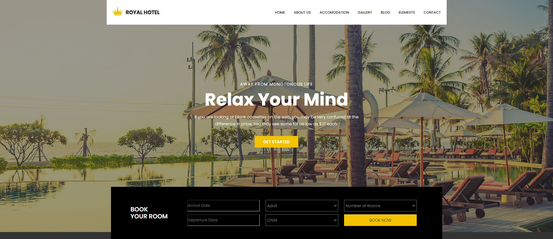
    <section id="section1">
        <div id="background">
        <br>
        </div>
        <div id="relax">
            <h6>away from monotonous life</h6>
            <h2>Relax Your Mind</h2>
            <p>If you are looking at blank cassettes on the web, you may be very confused at the<br> difference in price. You may see some for as low as $.17 each.</p>
            <a href="#">get started</a>
        </div>
        <div id="book">
            <div id="book_yourroom">
                <h2>BOOK<br>YOUR ROOM</h2>
            </div>
            <div class="booking_option">
                <input type='text' class="form-control" placeholder="Arrival Date"/>
                <span class="input-group-addon">
                    <!-- <i class="fa fa-calendar" aria-hidden="true"></i> -->
                </span>
                <input type='text' class="form-control" placeholder="Departure Date"/>
                <span class="input-group-addon">
                <!-- <i class="fa fa-calendar" aria-hidden="true"></i> -->
                </span>
                <select class="wide">
                    <option data-display="Adult">Adult</option>
                    <option value="1">Old</option>
                    <option value="2">Younger</option>
                    <option value="3">Potato</option>
                </select>
                <select class="wide">
                    <option data-display="Child">Child</option>
                    <option value="1">Child</option>
                    <option value="2">Baby</option>
                    <option value="3">Child</option>
                </select>
                <select class="wide">
                    <option data-display="Child">Number of Rooms</option>
                    <option value="1">Room 01</option>
                    <option value="2">Room 02</option>
                    <option value="3">Room 03</option>
                </select>
                <a class="book_now_btn button_hover" href="#">Book Now</a>
            </div>
        </div>
        <div id="background_black">
            <br>
        </div>
    </section>
css
/* section 1 시작 */
#section1{
    /* 부모 속성 */
    color: white;
    align-items: center;
    justify-content: center;
    /* 자신 속성 */
    min-height: 800px;
    position: relative;
    background: rgba(0, 0, 0, 0.8);
}
#background{
    background-image: url(image/banner_bg.jpg);
    background-size: cover;
    opacity: 0.5;
    width: 100%;
    height: 100%;
    min-height: 800px;
    z-index: -4;
}
/* #background_black{
    min-height: 800px;
    width: 100%;
    height: 100%;
    position: absolute;
    top: 0;
    left: 0;
} */
#relax{
    /* 부모 속성 */
    text-align: center;
    /* 자신 속성 */
    position: relative;
    margin-top: 50px;
    margin-bottom: 94px;
    position: absolute;
    top: 50%;
    left: 50%;
    transform: translate(-50%, -80%);
    width: 100%;
    z-index: 2;
}
#relax h6{
    font-size: 14px;
    line-height: 30px;
    letter-spacing: 1.4px;
    font-weight: 400;
    text-transform: uppercase;
    margin-bottom: 0.5rem;
}
#relax h2{
    font-size: 60px;
    line-height: 60px;
    font-weight: 700;
    margin-bottom: 0.5rem;
}
#relax p{
    font-weight: 300;
    font-size: 14px;
    line-height: 24px;
    padding: 10px 0 20px;
}
#relax a{
    display: inline-block;
    color: white;
    background-color: #f3c300;
    padding: 5px 30px;
    margin: 10px 0 0 0;
    text-transform: uppercase;
    font-size: 14px;
    line-height: 30px;
    font-weight: 600;
}


#book{
    /* 부모 속성 */
    display: flex;
    justify-content: space-evenly;
    /* 자신 속성 */
    position: absolute;
    top: 100%;
    left: 50%;
    transform: translate(-50%,-100%);
    width: 85%;
    max-width: 1140px;
    background-color: black;
    height: 180px;
    padding: 20px;
    z-index: 2;
}
#book_yourroom{
    /* 부모 속성 */

    /* 자신 속성 */
    margin: auto 0;
}
#book_yourroom h2{
    font-weight: 600;
}
.booking_option{
    display: flex;
    flex-direction: column;
    flex-wrap: wrap;
    justify-content: center;

    margin: 10px;
}
/* .booking_option ::placeholder{
    margin: 0 10px;
} */
#book .form-control{
    width: 250px;
    height: 40px;
    margin: 5px 10px;
    background-color: black;

}
#book .wide{
    width: 250px;
    height: 40px;
    margin: 5px 10px;
    background-color: black;
    color: gray;
}
#book .wide option{
    background-color: white;
    border-radius: 2px;
}
#book a{
    width: 250px;
    height: 40px;
    line-height: 40px;
    margin: 5px 10px;
    color: black;
    text-align: center;
    background-color: #f3c300;
    text-transform: uppercase;
}
/* section 1 끝 */
html
    <section id="accomodation">
        <div id="acco">
            <h2>Hotel Accomodation</h2>
            <p>We all live in an age that belongs to the young at heart. Life that is becoming extremely fast, </p>
        </div>
        <div id="acco_picture">
            <div class="acco_box">
                <div class="acco_imgbox">
                    <img src="image/room1.jpg" alt="room1">
                    <a href="#">BOOK NOW</a>
                </div>
                <div class="acco_textbox">
                    <a href="">Double Deluxe Room</a>
                    <h5>$250<small>/night</small></h5>
                </div>
            </div>
            <div class="acco_box">
                <div class="acco_imgbox">
                    <img src="image/room2.jpg" alt="room2">
                    <a href="#">BOOK NOW</a>
                </div>
                <div class="acco_textbox">
                    <a href="">Single Deluxe Room</a>
                    <h5>$200<small>/night</small></h5>
                </div>
            </div>
            <div class="acco_box">
                <div class="acco_imgbox">
                    <img src="image/room3.jpg" alt="room3">
                    <a href="#">BOOK NOW</a>
                </div>
                <div class="acco_textbox">
                    <a href="">Honeymoon Suit</a>
                    <h5>$750<small>/night</small></h5>
                </div>
            </div>
            <div class="acco_box">
                <div class="acco_imgbox">
                    <img src="image/room4.jpg" alt="room4">
                    <a href="#">BOOK NOW</a>
                </div>
                <div class="acco_textbox">
                    <a href="">Economy Double</a>
                    <h5>$050<small>/night</small></h5>
                </div>
            </div>
        </div>
    </section>
css
/* accomodation 시작 */
#accomodation{
    /* 부모 속성 */
    justify-content: center;
    align-items: center;
    /* 자신 속성 */
    padding: 120px 0;
    max-width: 1170px;
    margin: 0 auto;
}
#acco{
    text-align: center;
    margin-bottom: 75px;
}
#acco h2{
    color: black;
    font-size: 36px;
    line-height: 45px;
    font-weight: 600;
}
#acco p{
    font-size: 14px;
    line-height: 30px;
    color: #777;
}
#acco_picture{
    justify-content: space-evenly;
    align-items: center;
    display: flex;
}
#acco_picture .acco_box{
    margin-left: 15px;
}
.acco_imgbox{
    /* 부모 속성 */
    position: relative;
}
.acco_imgbox a{
    position: absolute;
    bottom: 20px;
    left: 50%;
    transform: translateX(-50%);
    color: white;
    background-color: #f3c300;
    padding: 5px 25px;
    max-width: 130px;
    font-weight: 600;
    font-size: 14px;
    line-height: 30px;
    text-transform: uppercase;
}
.acco_textbox{
    /* 부모 속성 */
    text-align: center;
}
.acco_textbox a{
    font-weight: 600;
    font-size: 18px;
    line-height: 38px;
    color: #222;
}
.acco_textbox h5{
    font-size: 24px;
    line-height: 28px;
    color: #52c5fd;
    font-weight: 600;
}
.acco_textbox h5 small{
    font-weight: 300;
    font-size: 14px;
}
/* accomodation 끝 */

html
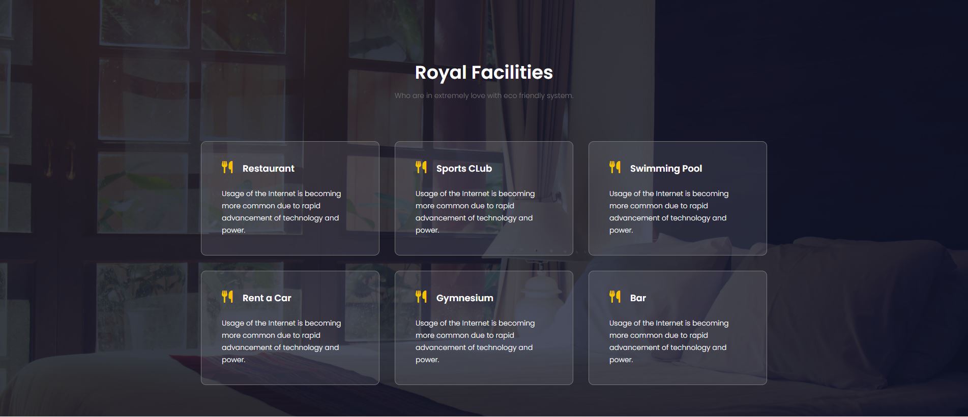
    <section id="Facilities">
        <div id="fac_area">
            <br>
        </div>
        <div id="facility_title">
            <h2>Royal Facilities</h2>
            <p>Who are in extremely love with eco friendly system.</p>
        </div>
        <div id="facility_card">
            <div class="faci_card">
                <div class="faci_card_title">
                    <h4><i class="fas fa-utensils"></i>Restaurant</h4>
                </div>
                <p>Usage of the Internet is becoming more common due to rapid advancement of technology and power.</p>

            </div>
            <div class="faci_card">
                <div class="faci_card_title">
                    <h4><i class="fas fa-utensils"></i>Sports CLub</h4>
                </div>
                <p>Usage of the Internet is becoming more common due to rapid advancement of technology and power.</p>
            </div>
            <div class="faci_card">
                <div class="faci_card_title">
                    <h4><i class="fas fa-utensils"></i>Swimming Pool</h4>
                </div>
                <p>Usage of the Internet is becoming more common due to rapid advancement of technology and power.</p>
            </div>
            <div class="faci_card">
                <div class="faci_card_title">
                    <h4><i class="fas fa-utensils"></i>Rent a Car</h4>
                </div>
                <p>Usage of the Internet is becoming more common due to rapid advancement of technology and power.</p>
            </div>
            <div class="faci_card">
                <div class="faci_card_title">
                    <h4><i class="fas fa-utensils"></i>Gymnesium</h4>
                </div>
                <p>Usage of the Internet is becoming more common due to rapid advancement of technology and power.</p>
            </div>
            <div class="faci_card">
                <div class="faci_card_title">
                    <h4><i class="fas fa-utensils"></i>Bar</h4>
                </div>
                <p>Usage of the Internet is becoming more common due to rapid advancement of technology and power.</p>
            </div>
        </div>
    </section>
css
/* Facilities 시작 */
#Facilities{
    color: white;
    background: url(image/facilites_bg.jpg);
    position: relative;
    top: 0;
    left: 0;
    height: 820px;
    z-index: -1;
    padding: 120px 0;
}
#fac_area{
    background: #04091e;
    z-index: -1;
    position: absolute;
    top: 0;
    left: 0;
    width: 100%;
    height: 100%;
    opacity: 0.8;

}
#facility_title{
    text-align: center;
    /* 자신 속성 */
    margin-bottom: 75px;
}
#facility_title h2{
    font-size: 36px;
    line-height: 45px;
    font-weight: 600;
    margin-bottom: 0.5rem;
}
#facility_title p{
    font-size: 14px;
    line-height: 30px;
    color: #777;
}
#facility_card{
    /* 부모 속성 */
    display: flex;
    flex-wrap: wrap;
    justify-content: center;
    /* 자신 속성 */
    max-width: 1170px;
    margin: 0 auto;
}
.faci_card{
    color: #fff;

    border: 1px solid #777;
    border-radius: 10px;
    background-color: rgba(249, 249, 255, 0.102);
    margin-bottom: 30px;
    padding: 31px 40px 37px;

    max-width: 30%;
    margin: 0 15px 30px;
}
.faci_card h4{
    padding-bottom: 18px;
    font-size: 18px;
    line-height: 38px;
    font-weight: 600;
}
.faci_card i{
    color: #f3c300;
    font-size: 24px;
    line-height: 38px;
    display: inline-block;
    padding-right: 20px;
}
.faci_card p{
    font-size: 13;
}
/* Facilities 끝 */
html
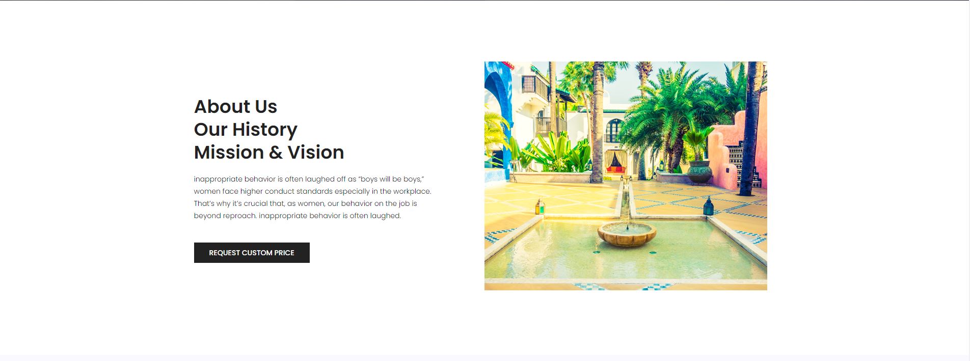
    <section id="AboutUs">
        <div class="container">
            <div id="about_textbox">
                <h2>About Us <br>Our History<br>Mission & Vision</h2>
                <p>inappropriate behavior is often laughed off as “boys will be boys,” women face higher conduct standards especially in the workplace. That’s why it’s crucial that, as women, our behavior on the job is beyond reproach. inappropriate behavior is often laughed.</p>
                <a href="#">Request Custom Price</a>
            </div>
            <div id="about_imagebox">
                <img src="image/about_bg.jpg" alt="">
            </div>
        </div>
    </section>
css
/* About Us 시작 */
#AboutUs{
     padding: 120px 0;
     background: #fff;
}
#AboutUs .container{

    display: flex;
    justify-content: cemter;
    align-items: center;
}
#about_textbox{
    color: black;
    width: 50%;
    padding: 0 75px 0 15px;
    text-align: left;
}
#about_textbox h2{
    font-size: 36px;
    line-height: 45px;
    font-weight: 600;
    color: #222;
}
#about_textbox p{
    padding: 18px 0 30px;
    margin-bottom: 1rem;
}
#about_textbox a{
    color: white;
    background-color: #222;
    font-size: 14px;
    font-weight: 500;
    line-height: 30px;
    text-transform: uppercase;
    padding: 10px 30px;
}
/* About Us 끝 */
html
    <section id="Client">
        <div class="container">
            <div id="client_title">
                <h2 class="title_color">Testimonial from our Clients</h2>
                <p>The French Revolution constituted for the conscience of the dominant aristocratic class a fall from </p>
            </div>
            <div id="client_box">
                <div class="client_card">
                    <div class="client_img">
                        <img src="image/testtimonial-1.jpg" alt="">
                    </div>
                    <div class="client_text">
                        <p>As conscious traveling Paupers we must always be concerned about our dear Mother Earth. If you think about it, you travel across her face, and She is the </p>
                        <a href="#"><h4>Fanny Spencer</h4></a>
                        <div class="star">
                            <a href="#"><i class="fa fa-star"></i></a>
                            <a href="#"><i class="fa fa-star"></i></a>
                            <a href="#"><i class="fa fa-star"></i></a>
                            <a href="#"><i class="fa fa-star"></i></a>
                            <a href="#"><i class="fa fa-star-half-o"></i></a>
                        </div>
                    </div>
                </div>
            </div>
            <div class="box">
                <div class="boxes">
                    <br>
                </div>
                <div class="boxes">
                    <br>
                </div>
            </div>
        </div>
    </section>
css
/* Clients 시작 */
#Client{
    background-color: #f9f9ff;
}
#Client .container{
    text-align: center;
    padding: 120px 0;
}
#client_title{
    margin-bottom: 75px;
}
#client_title h2{
    font-size: 36px;
    line-height: 45px;
    font-weight: 600;
    color: #222;
    margin-bottom: 0.5rem;
}
#client_box{
    display: flex;
}
.client_card{
    /* 부모 속성 */
    display: flex;
    text-align:start;

    /* 자신 속성 */
    width: 555px;
    margin: 0 15px;
    background-color: #fff;
    padding: 20px 20px;
}
.client_img{
    margin: 20px 0 0 20px;
}
.client_text{
    margin: 20px 20px 20px 30px;
}
.client_text p{
    margin-bottom: 10px;
}
.client_text h4{
    font-size: 18px;
    line-height: 30px;
    font-weight: 600;
    color: #222;
}
.star a{
    color: #f3c300;
}
.box{
    display: flex;
    justify-content: center;
    margin: 100px;
}
.boxes{
    background-color: #f3c300;
    width: 15px;
    height: 15px;
    margin: 0 5px;
}
/* Clients 끝 */

html
    <section id="blog">
        <div class="container">
            <div id="blog_title">
                <h2>latest posts from blog</h2>
                <p>The French Revolution constituted for the conscience of the dominant aristocratic class a fall from </p>
            </div>
            <div id="blog_box">
                <div class="blog_boxes">
                    <img src="image/blog/blog-1.jpg" alt="">
                    <div class="blog_text">
                        <div class="blog_a">
                            <a href="">Travel</a>
                            <a href="">Life Style</a>
                        </div>
                        <div class="blog_btext">
                            <a href="#"><h4 class="sec_h4">Low Cost Advertising</h4></a>
                            <p>Acres of Diamonds… you’ve read the famous story, or at least had it related to you. A farmer.</p>
                            <h6 class="date title_color">31st January,2018</h6>
                        </div>
                    </div>
                </div>
                <div class="blog_boxes">
                    <img src="image/blog/blog-2.jpg" alt="">
                    <div class="blog_text">
                        <div class="blog_a">
                            <a href="">Travel</a>
                            <a href="">Life Style</a>
                        </div>
                        <div class="blog_btext">
                            <a href="#"><h4 class="sec_h4">Creative Outdoor Ads</h4></a>
                            <p>Self-doubt and fear interfere with our ability to achieve or set goals. Self-doubt and fear are</p>
                            <h6 class="date title_color">31st January,2018</h6>
                        </div>
                    </div>
                </div>
                <div class="blog_boxes">
                    <img src="image/blog/blog-3.jpg" alt="">
                    <div class="blog_text">
                        <div class="blog_a">
                            <a href="">Travel</a>
                            <a href="">Life Style</a>
                        </div>
                        <div class="blog_btext">
                            <a href="#"><h4 class="sec_h4">It S Classified How To Utilize Free</h4></a>
                            <p>Why do you want to motivate yourself? Actually, just answering that question fully can </p>
                            <h6 class="date title_color">31st January,2018</h6>
                        </div>
                    </div>
                </div>
            </div>
        </div>
    </section>
css
/* blog 시작 */
#blog{
    padding: 120px 0;
}
#blog_title{
    text-align: center;
    /* 자신 속성 */
    margin-bottom: 75px;
}
#blog_title h2{
    font-size: 36px;
    line-height: 45px;
    font-weight: 600;
    color: #222;
    margin-bottom: 0.5rem;
}
#blog_box{
    /* 부모 속성 */
    display: flex;
}
.blog_boxes{
    padding: 0 15px;
}
.blog_text{
    padding-top: 30px;
}
.blog_a a{
    font-size: 12px;
    font-weight: 500;
    line-height: 20px;
    border: 1px solid #eee;
    display: inline-block;
    padding: 1px 20px;
    color: #222;
}
.blog_btext h4{
    font-size: 18px;
    font-weight: 600;
    color: #222;
    padding: 10px 0;
}
.blog_btext h6{
    color: #222;
    font-size: 14px;
    line-height: 24px;
    font-weight: 400;
    margin: 10px 0;
}
/* blog 끝 */

'정리노트' 카테고리의 다른 글
| [html, css] label과 radio 연결 (0) | 2023.11.20 |
|---|---|
| [html, css] Flexbox Froggy, CSS Dinner (0) | 2023.11.17 |
| [html, css] (0) | 2023.11.16 |
| [html, css] 포트폴리오 웹페이지 제작 (0) | 2023.11.14 |
| [html, css] 효과와 애니메이션, 포트폴리오-nav (0) | 2023.11.13 |